Style Guide
Brand
For logo usage, brand marks, and full brand identity guidelines, refer to the Redenlab Brand Style Guide provided separately. This web style guide covers the digital implementation of the brand system — colors, typography, components, and design tokens as used on the website.
Brand Colors (Web)
Imagery
Redenlab's visual language relies on two complementary image categories, chosen deliberately to communicate the science without sensationalising the human conditions we study. For complete guidance on image sourcing, cropping, and editorial usage, refer to the Redenlab Brand Style Guide.
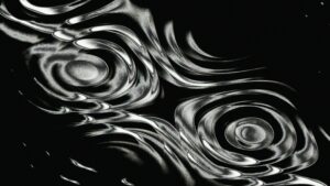
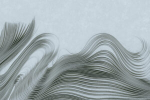
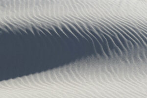
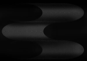
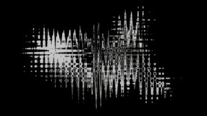
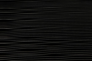
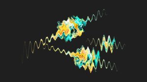
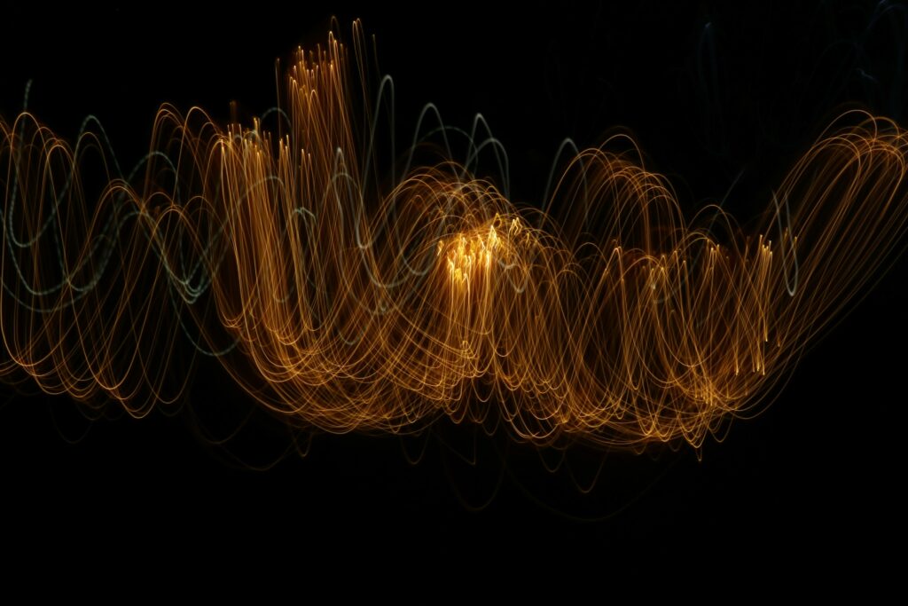
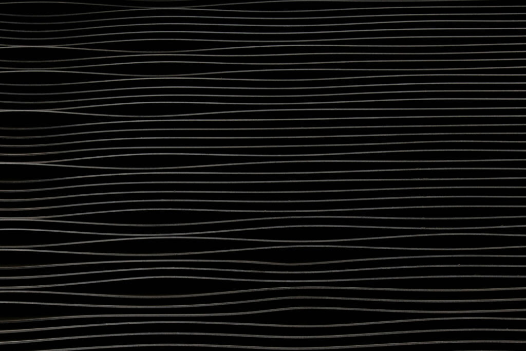
Abstract Patterns
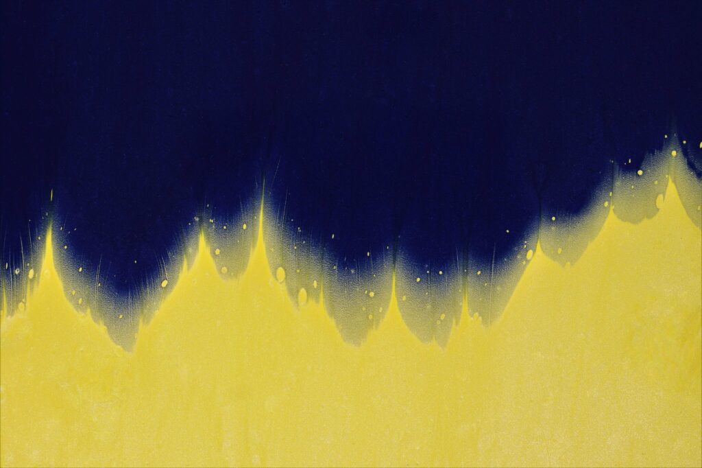
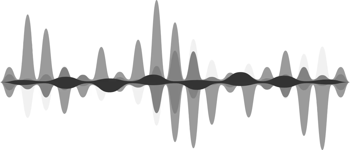
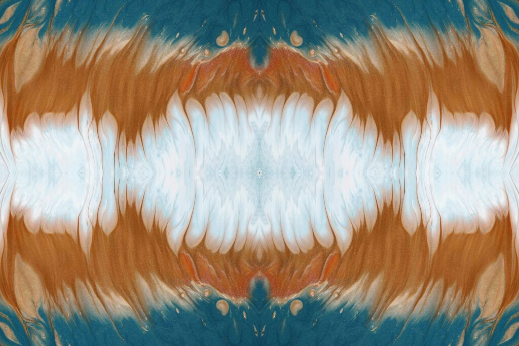
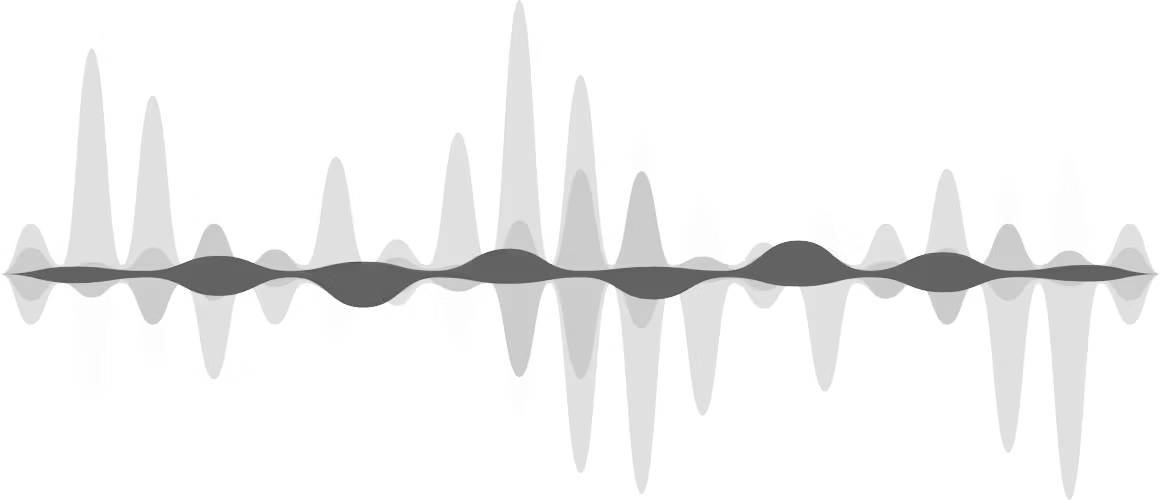
The primary image category is abstract, organic patterns — textures that evoke waveforms, neural pathways, and fluid dynamics without depicting identifiable individuals. This approach respects the dignity of the communities and patients at the centre of our research, avoiding imagery that could be perceived as reductive or distressing. Abstracts are ideal for hero sections, card backgrounds (with duotone overlays), presentation slides, and social media assets.
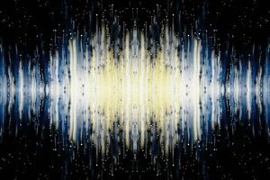
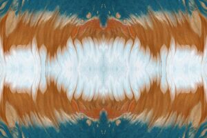
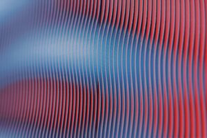


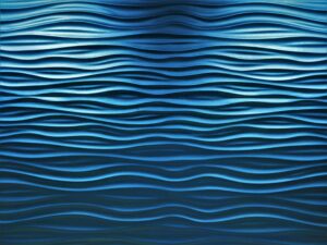
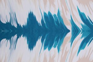
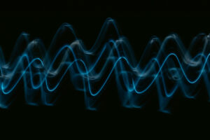
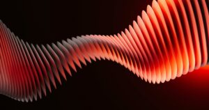
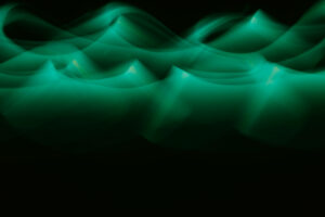
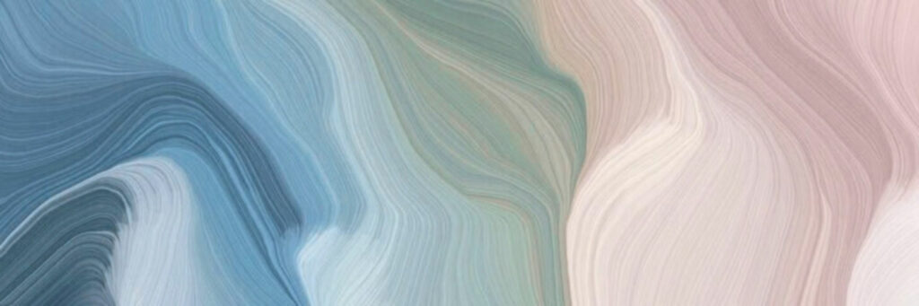
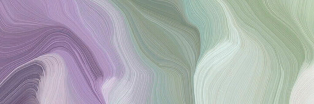
Brand Wave Patterns
Custom-made wave patterns in the Redenlab brand palette, designed as wide-format backgrounds and banners. These combine the waveform motif with the Primary and Secondary colour system.
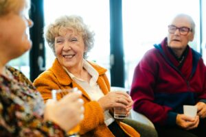
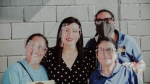
People & Human Connection
When the goal is to humanise a story — team profiles, partner spotlights, collaborative research — we use photographs of real people. These images should convey warmth, expertise, and purposeful collaboration rather than clinical settings. They are best used on About pages, team sections, and editorial features where a personal connection adds meaning.


Colors
The Redenlab Web Design System provides 25 color tokens. Hex values are shown for cross-platform use (Canva, Figma, print, social assets). CSS variable names are included for web implementation.
Primary (1)
Primary alt (9)
Secondary (1)
Secondary alt (9)
Tertiary (1)
Tertiary alt (1)
Bg body (1)
Text (2)
Typography
Fluid type scale — sizes adapt proportionally between small screens and large displays. The min → max range shows the smallest and largest value each step reaches.
Font Families
BlackerSans
Headings & Navigation
ABCDEFGHIJKLMNOPQRSTUVWXYZ
abcdefghijklmnopqrstuvwxyz
0123456789
Weights: 400 (Regular), 500 (Medium), 600 (Book), 700 (Bold)
Jost
Body Copy & UI
ABCDEFGHIJKLMNOPQRSTUVWXYZ
abcdefghijklmnopqrstuvwxyz
0123456789
Variable font — Weights: 400 (Regular), 500 (Medium), 700 (Bold)
Type Scale
1.38rem → 4.47rem The quick brown fox jumps over the lazy dog
1.3rem → 3.35rem The quick brown fox jumps over the lazy dog
1.22rem → 2.52rem The quick brown fox jumps over the lazy dog
1.14rem → 1.89rem The quick brown fox jumps over the lazy dog
1.07rem → 1.42rem The quick brown fox jumps over the lazy dog
1rem → 1.06rem The quick brown fox jumps over the lazy dog
0.94rem → 0.8rem The quick brown fox jumps over the lazy dog
0.88rem → 0.6rem The quick brown fox jumps over the lazy dog
Heading Hierarchy
Heading 1 — Redenlab Digital Biomarkers
Heading 2 — Redenlab Digital Biomarkers
Heading 3 — Redenlab Digital Biomarkers
Heading 4 — Redenlab Digital Biomarkers
Heading 5 — Redenlab Digital Biomarkers
Heading 6 — Redenlab Digital Biomarkers
Links
Link styles used across the site — standard inline links and standalone text-link call-to-actions.
Standard Links
Links use medium weight (500) and are underlined by default. The underline is removed on hover. Color is inherited from the surrounding text or set explicitly per context.
This is a paragraph with a standard inline link inside running text. Hover to see the underline disappear.
| Property | Value |
|---|---|
| Font weight | Medium (500) |
| Underline | Visible by default, removed on hover |
| Color | Inherited from context |
Text Links
Standalone call-to-action elements used on cards and content blocks. An uppercase label with a Phosphor duotone arrow that slides right on hover. No underline — color is inherited from the container.
| Property | Value |
|---|---|
| Layout | Inline-flex, vertically centered, 5 px gap |
| Text style | Uppercase, font-weight 500 |
| Underline | None |
| Icon | Phosphor duotone arrow-right (20 px) |
| Hover | Arrow translates 4 px right, 0.3 s ease-in-out |
| Color | Inherited from container |
Spacing
Fluid spacing scale — each step scales proportionally with screen size. Each bar shows the live dimension; min/max values are listed for reference.
Border Radius
Corner rounding applied to cards, buttons, and containers. Values scale with screen size; min → max range shown.
Shadows
Four elevation levels that create a sense of depth and layering. Each step increases the vertical offset, blur radius, and opacity to lift elements further off the page.
Shadow Specifications
To recreate these shadows in any design tool (Figma, Sketch, Canva, Adobe XD), apply a drop shadow with the values below. The shadow color is always black at the listed opacity.
| Level | X | Y | Blur | Spread | Color / Opacity | When to Use |
|---|---|---|---|---|---|---|
| XS | 0px | 1px | 2px | 0px | #000000 at 6% | Subtle lift — pressed buttons, input fields, inline chips. |
| S | 0px | 2px | 6px | 0px | #000000 at 8% | Cards resting on a surface. Default card elevation. |
| M | 0px | 4px | 16px | 0px | #000000 at 10% | Raised cards, dropdowns, popovers. |
| L | 0px | 8px | 30px | 0px | #000000 at 14% | Modals, floating panels, expanded menus. |
Icons
The Design System uses Phosphor Icons in the duotone weight. Below is a sample of commonly used icons. Browse and search the full set at phosphoricons.com.
Cards & Badges
Reusable card and badge patterns used across the site for content grouping and labelling.
Badges
Feature Cards
Feature cards in 5 color variants, each pairing a background from the brand palette with a contrasting text color.
Primary
Primary Alt
Secondary
Secondary Alt
Neutral
Duotone Effects
Duotone overlays tint a desaturated photograph with a brand color, creating a cohesive visual identity across hero images, cards, and backgrounds. The technique works in any design tool — the steps below explain how to reproduce it universally.
Live Examples
Feature cards with a full-bleed background image and duotone overlay applied. Each card demonstrates a different blend mode — Multiply darkens, Screen lightens, and Overlay adds contrast.
Primary Multiply
Primary Screen
Secondary Multiply
Secondary Screen
Primary Overlay
Secondary Overlay
How to Recreate in Any Tool
The duotone effect is a three-step process that works identically across Photoshop, Figma, Canva, Affinity, and any tool that supports blend modes:
- Desaturate the image — Convert to grayscale (Photoshop: Image > Adjustments > Desaturate; Canva: set Saturation to −100; Figma: Saturation 0).
- Adjust the base contrast — Increase contrast slightly to give the grayscale image more tonal range. This determines how dramatic the final result looks (see intensity presets below).
- Add a solid color layer on top — Fill with the brand color (see table), then set the layer's blend mode to Multiply, Screen, or Overlay depending on the desired effect.
Blend Mode Guide
| Blend Mode | Effect | Best For |
|---|---|---|
| Multiply | Darkens the image through the overlay color. Shadows become rich and deep, midtones take on the brand color, highlights remain relatively bright. | Hero images, dramatic backgrounds, text overlay areas where you need dark contrast. |
| Screen | Lightens the image through the overlay color. Creates an airy, washed-out, vintage feel. The opposite of Multiply. | Subtle backgrounds, light sections, anywhere you want a soft tint without heavy darkening. |
| Overlay | Combines Multiply and Screen — darks get darker, lights get lighter. Adds contrast and saturation simultaneously. | Balanced, punchy results. Good general-purpose choice when you want vibrancy without extremes. |
Color × Blend Mode Matrix
Use these hex values as the solid fill color for the overlay layer:
| Variant | Overlay Color | Multiply | Screen | Overlay |
|---|---|---|---|---|
| Primary | #633269 | Deep purple shadows | Soft lilac wash | Rich purple contrast |
| Secondary | #003D20 | Dark forest tones | Soft sage wash | Vivid emerald contrast |
Intensity Presets
Before applying the color overlay, adjust the grayscale image's contrast and brightness to control the final mood. These presets go from soft and editorial to bold and dramatic:
| Preset | Contrast | Brightness | Result |
|---|---|---|---|
| Softer | −40% | +30% | Very washed out, editorial feel. Faded colour, lots of white. |
| Soft | −20% | +20% | Gentle tint. Good for light backgrounds behind text. |
| Light | 0% | +10% | Subtle colour wash. Image detail is preserved. |
| Neutral | 0% | 0% | No modification. True grayscale + pure blend. |
| Normal (default) | +20% | 0% | Standard branded look. The default on the website. |
| Punchy | +50% | −10% | Bold and graphic. Strong brand colour, less image detail. |
| Intense | +80% | −20% | Dramatic, near-posterised. Maximum impact. |
Percentages are relative adjustments from the neutral baseline. In Photoshop/Lightroom, apply via Brightness/Contrast. In Canva, use the image adjustment sliders. In Figma, apply via the Exposure and Contrast controls or a plugin.
Web Implementation Reference
On the website, duotone effects are applied automatically via CSS blend modes using data-duotone="variant"
attributes or .duotone-{variant} classes. Intensity is controlled with data-intensity="preset".
See the source stylesheet duotone-effect.css for full implementation details.
Counter Cards
Animated counter cards alternating between Primary (#633269) and Secondary (#003D20) backgrounds. Numbers count up on scroll; each card displays a metric with an optional suffix (k, +, %).
COUNTRIES
PARTICIPANTS
HOURS
RECORDINGS
PUBLICATIONS
Tables
Data tables use a solid Primary header with white text, alternating row backgrounds for scanability, and an em-dash for empty cells. The first column stays pinned on horizontal scroll and a totals row anchors the bottom in a secondary accent.
Live Example
| Condition / Disease | Phase 0 | Phase I | Phase II | Phase III | Phase IV | Publications |
|---|---|---|---|---|---|---|
| Ataxia Telangiectasia | 1 | 2 | ||||
| Batten disease (CLN) | 1 | 3 | ||||
| Depression | 1 | 1 | ||||
| FOXP2 | 1 | 3 | 6 | 1 | 10 | |
| Friedreich ataxia | 5 | 1 | 45 | |||
| Huntington's disease | 4 | 10 | ||||
| Multiple Sclerosis | 4 | 2 | 25 | |||
| Stuttering | 3 | 1 | 10 | |||
| Total | 19 | 3 | 9 | 1 | 2 | 106 |
Anatomy
| Element | Style |
|---|---|
| Header row | Solid Primary (#633269) background, white text, uppercase, letter-spacing 0.05em, font-weight 600 |
| Body rows | Alternating white / light grey. Hover highlights with a subtle secondary tint. |
| First column | Sticky on horizontal scroll with a subtle right shadow. Text in Primary color, font-weight 500. |
| Empty cells | Display an em-dash (—) in a light grey to indicate no data without leaving a blank gap. |
| Data cells with values | Center-aligned, tabular numerals, font-weight 600 in a dark secondary tone. |
| Totals row | Secondary light background (#C5E8CE), 2px top border in Secondary, bold text. |
| In-table links | Primary color with an underline. Hover darkens to Primary dark. |
Responsive Behaviour
On smaller screens the table scrolls horizontally inside its container. The first column remains pinned so the row label is always visible. A "Swipe to explore" hint appears on mobile.
Responsive Breakpoints
Screen widths where the layout adapts. Useful for responsive mockups in Figma or any prototyping tool.
| Name | Breakpoint | Target | Usage |
|---|---|---|---|
| XL | 1400px |
Large desktops | Max content width, wide layouts |
| L | 992px |
Desktop / landscape tablets | Grid collapses, sidebar stacks |
| M | 768px |
Tablets | Navigation changes, 2-col to 1-col |
| S | 480px |
Mobile phones | Full-width layouts, stacked elements |